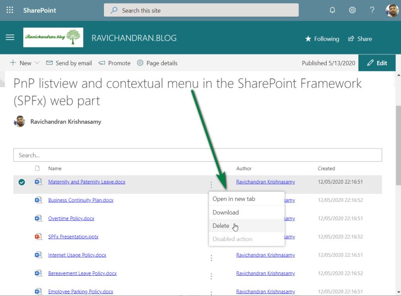
PnP listview and contextual menu in the SharePoint Framework (SPFx) web part

This article provide steps to implement the PnP Listview with contextual menu in the SharePoint Framework (SPFx), generally Listview control can be used to make fully custom list view for SharePoint List or Library and the contextual menu helps provide options to manages file or list item.

Create a new web part project

Open power shell and run following comment to create a new web part by running the Yeoman SharePoint Generator

yo @microsoft/sharepoint

When prompted:

Enter the webpart name as your solution name, and then select Enter.
Select Create a subfolder with solution name for where to place the files.
Select Y to allow the solution to be deployed to all sites immediately.
Select N on the question if solution contains unique permissions.
Select WebPart as the client-side component type to be created.

The next set of prompts ask for specific information about your web part:

Enter your web part name, and then select Enter.
Enter your web part description, and then select Enter.
Select React framework as the framework you would like to use, and then select Enter.

Start Visual Studio Code (or your favorite code editor) within the context of the newly created project folder.

cd .\web part name\
code .

Install the library and required dependencies

npm install @pnp/sp --save
npm install @pnp/spfx-controls-react --save --save-exact
npm install moment --save

Import the library into your application, update constructor, and access the root sp object in render for PnPjs libraries.

sp.setup({spfxContext: this.props.spcontect});

Configure the custom properties

Create a new source code file under the src\webparts\<Webpart name>\components\ folder of the solution. Create the new file I<web part name>State.ts and use it to create a TypeScript Interface

import { IViewField } from "@pnp/spfx-controls-react/lib/ListView";

export interface ISpfxPnpListviewContextualmenuState {
  items: any[];
  viewFields: IViewField[];
}

In addition, you need to update the render method of the client-side web part to create a properly configured instance of the React component for rendering. The following code shows the updated method definition.

  public render(): void {
    const element: React.ReactElement<ISpfxPnpListviewContextualmenuProps> = React.createElement(
      SpfxPnpListviewContextualmenu,
      {
        description: this.properties.description,
        context:this.context
      }
    );
    ReactDom.render(element, this.domElement);
  }

Update the tsx file under the components. First, add some import statements to import the types you defined earlier. Notice the import for I<web part name>Props and I<web part name>State. There are also some imports for the PnP components used to render the UI of the PnP React component and pnp sp imports.

import * as React from 'react';
import * as moment from 'moment';
import styles from './SpfxPnpListviewContextualmenu.module.scss';
import { ISpfxPnpListviewContextualmenuProps } from './ISpfxPnpListviewContextualmenuProps';
import { ISpfxPnpListviewContextualmenuState } from './ISpfxPnpListviewContextualmenuState';
import { ListView, IViewField, SelectionMode, GroupOrder, IGrouping } from "@pnp/spfx-controls-react/lib/ListView";
import { sp } from "@pnp/sp";
import { autobind } from 'office-ui-fabric-react/lib/Utilities';
import "@pnp/sp/webs";
import "@pnp/sp/files";
import "@pnp/sp/folders";
import { IfilemenuProps, filemenu } from './filemenu';

Replace this render function with the following code.

  public render(): React.ReactElement<ISpfxPnpListviewContextualmenuProps> {
    return (
      <div className={styles.spfxPnpListviewContextualmenu}>
        <ListView
          items={this.state.items}
          viewFields={this.state.viewFields}
          iconFieldName="ServerRelativeUrl"
          compact={true}
          selectionMode={SelectionMode.multiple}
          selection={this._getSelection}
          showFilter={true}
          filterPlaceHolder="Search..." />
      </div>
    );
  }

Adding ContextualMenu component

We have to create a new component for ContextualMenu, this ContextualMenu is from the Microsoft fluentui

import * as React from 'react';
import { IconButton } from 'office-ui-fabric-react';
import { ContextualMenuItemType } from 'office-ui-fabric-react/lib/ContextualMenu';
import { sp } from "@pnp/sp";
import "@pnp/sp/webs";
import "@pnp/sp/lists";
import "@pnp/sp/items";
import { autobind } from 'office-ui-fabric-react/lib/Utilities';

export interface IfilemenuProps {
    item: any;
    context: any;
    ondatachange: any;
}


export class filemenu extends React.Component<IfilemenuProps, {}> {

    public constructor(props: IfilemenuProps) {
        super(props);
        sp.setup({
            spfxContext: this.props.context
        });
        this.state = {
            panelOpen: false
        };
    }

    public render() {
        return (
            <div>
                <IconButton id='ContextualMenuButton1'
                    text=''
                    width='30'
                    split={false}
                    iconProps={{ iconName: 'MoreVertical' }}
                    menuIconProps={{ iconName: '' }}
                    menuProps={{
                        shouldFocusOnMount: true,
                        items: [
                            {
                                key: 'action1',
                                name: 'Open in new tab',
                                onClick: this.handleClick.bind(this, "open", this.props.item)
                            },
                            {
                                key: 'divider_1',
                                itemType: ContextualMenuItemType.Divider
                            },
                            {
                                key: 'action2',
                                name: 'Download',
                                onClick: this.handleClick.bind(this, "download", this.props.item)
                            },
                            {
                                key: 'action3',
                                name: 'Delete',
                                onClick: this.handleClick.bind(this, "delete", this.props.item)
                            },
                            {
                                key: 'disabled',
                                name: 'Disabled action',
                                disabled: true,
                                onClick: () => console.error('Disabled action should not be clickable.')
                            }
                        ]
                    }} />
            </div>
        );
    }

    @autobind
    private async handleClick(actionType: string, seletedfile: any, event) {
        if (actionType === 'open') {
            window.open(
                window.location.protocol + "//" + window.location.host + seletedfile.ServerRelativeUrl + "?web=1",
                '_blank'
            );
        }
        else if (actionType === 'download') {
            window.open(
                window.location.protocol + "//" + window.location.host + seletedfile.ServerRelativeUrl + "?web=0",
                '_blank'
            );
        }
        else if (actionType === 'delete') {
            let list = sp.web.lists.getByTitle("Policies");
            await list.items.getById(seletedfile["ListItemAllFields.ID"]).delete();
            this.props.ondatachange();
        }
    }
}

Update the React component type declaration and add a constructor, as shown in the following example and call the ContextualMenu component as the list view column.

export default class SpfxPnpListviewContextualmenu extends React.Component<ISpfxPnpListviewContextualmenuProps, ISpfxPnpListviewContextualmenuState> {
  constructor(props: ISpfxPnpListviewContextualmenuProps, state: ISpfxPnpListviewContextualmenuState) {
    super(props);
    sp.setup({
      spfxContext: this.props.context
    });
    var _viewFields: IViewField[] = [
      {
        name: "Name",
        linkPropertyName: "ServerRelativeUrl",
        displayName: "Name",
        sorting: true,
        minWidth: 250,
      },
      {
        name: "",
        sorting: false,
        maxWidth: 40,
        render: (rowitem: any) => {
          const element: React.ReactElement<IfilemenuProps> = React.createElement(
            filemenu,
            {
              item: rowitem,
              context: this.props.context,
              ondatachange: this._getfiles
            }
          );
          return element;
        }
      },
      {
        name: "Author.Title",
        displayName: "Author",
        sorting: false,
        minWidth: 180,
        render: (item: any) => {
          const authoremail = item['Author.UserPrincipalName'];
          return <a href={'mailto:' + authoremail}>{item['Author.Title']}</a>;
        }
      },
      {
        name: "TimeCreated",
        displayName: "Created",
        minWidth: 150,
        render: (item: any) => {
          const created = item["TimeCreated"];
          if (created) {
            const createdDate = moment(created);
            return <span>{createdDate.format('DD/MM/YYYY HH:mm:ss')}</span>;
          }
        }
      }
    ];
    this.state = { items: [], viewFields: _viewFields };
    this._getfiles();
  }

place the below code inside the react component code, these functions using PnPjs to get files from the SharePoint document library

  @autobind
  public async _getfiles() {
    const allItems: any[] = await sp.web.getFolderByServerRelativeUrl("/sites/TheLanding/Policies").files.select().expand("ListItemAllFields,Author").get();
    this.setState({ items: allItems });
  }

Deploy the solution

You’re now ready to build, bundle, package, and deploy the solution.

Run the gulp commands to verify that the solution builds correctly.

gulp build

Use the following command to bundle and package the solution.

gulp bundle
gulp package-solution

Browse to the app catalog of your target tenant and upload the solution package. You can find the solution package under the sharepoint/solution folder of your solution. It is the .sppkg file. After you upload the solution package in the app catalog. you can find and the web part anywhere across the tenant.

Sharing is caring!

If you have any questions, feel free to let me know in the comments section.
Happy coding!!!

Comments

Fill in your details below or click an icon to log in:

WordPress.com Logo

You are commenting using your WordPress.com account. Log Out /  Change )

Twitter picture

You are commenting using your Twitter account. Log Out /  Change )

Facebook photo

You are commenting using your Facebook account. Log Out /  Change )

Connecting to %s