Tree view navigation using PnP Treeview control in the SharePoint Framework (SPFx) web part

This article provides steps to implement the Tree view navigation using PnP Treeview control in the SharePoint Framework (SPFx), generally, Treeview control allows to present a hierarchical view of information. Each tree item can have a number of subitems. This is often visualized by an indentation in a list. A tree item can be expanded to reveal subitems (if exist), and collapsed to hide subitems. in this article, we building the dynamic treeview navigation and data stored in the SharePoint list  

Create a new web part project

Open power shell and run the following comment to create a new web part by running the Yeoman SharePoint Generator

yo @microsoft/sharepoint

Install the required packages

npm install @pnp/sp --save
npm install @pnp/spfx-controls-react --save --save-exact

React Component

import * as React from 'react';
import styles from './SpfxPnpTreeview.module.scss';
import { ISpfxPnpTreeviewProps, ISpfxPnpTreeviewState } from './ISpfxPnpTreeview';
import { TreeView, ITreeItem, TreeViewSelectionMode, TreeItemActionsDisplayMode } from "@pnp/spfx-controls-react/lib/TreeView";

import { SPFI, spfi,SPFx } from "@pnp/sp";
import "@pnp/sp/webs";
import "@pnp/sp/lists";
import "@pnp/sp/items";

export default class SpfxPnpTreeview extends React.Component<ISpfxPnpTreeviewProps, ISpfxPnpTreeviewState> {
  constructor(props: ISpfxPnpTreeviewProps) {
    super(props);
    const sp = spfi().using(SPFx(this.props.context));
    this.state = {
      TreeLinks: []
    }
    this._getLinks(sp);
  }

  private async _getLinks(sp) {
    const allItems: any[] = await sp.web.lists.getByTitle("TreeLinks").items();

    var treearr: ITreeItem[] = [];
    allItems.forEach(function (v, i) {

      if (v["ParentId"] == null) {
        const tree: ITreeItem = {
          key: v.Id,
          label: v["Title"],
          data: v["Link"],
          children: []
        }
        treearr.push(tree);
      }
      else {
        const tree: ITreeItem = {
          key: v.Id,
          label: v["Title"],
          data: v["Link"]
        }
        var treecol: Array<ITreeItem> = treearr.filter(function (value) { return value.key == v["ParentId"] })
        if (treecol.length != 0) {
          treecol[0].children.push(tree);
        }
      }

      console.log(v);
    });
    console.log(treearr);
    this.setState({ TreeLinks: treearr });
  }

  public render(): React.ReactElement<ISpfxPnpTreeviewProps> {
    return (
      <div className={styles.spfxPnpTreeview}>
        <TreeView
          items={this.state.TreeLinks}
          defaultExpanded={false}
          selectionMode={TreeViewSelectionMode.None}
          selectChildrenIfParentSelected={true}
          showCheckboxes={true}
          treeItemActionsDisplayMode={TreeItemActionsDisplayMode.Buttons}
          onSelect={this.onTreeItemSelect}
          onExpandCollapse={this.onTreeItemExpandCollapse}
          onRenderItem={this.renderCustomTreeItem} />
      </div>
    );
  }
  private onTreeItemSelect(items: ITreeItem[]) {
    console.log("Items selected: ", items);
  }

  private onTreeItemExpandCollapse(item: ITreeItem, isExpanded: boolean) {
    console.log((isExpanded ? "Item expanded: " : "Item collapsed: ") + item);
  }

  private renderCustomTreeItem(item: ITreeItem): JSX.Element {
    return (
      <span>
        <a href={item.data} target={'_blank'}>
          {item.label}
        </a>
      </span>
    );
  }
}

Props/State Interface

import { ITreeItem } from "@pnp/spfx-controls-react/lib/TreeView";

export interface ISpfxPnpTreeviewState {
  TreeLinks: ITreeItem[];
}

export interface ISpfxPnpTreeviewProps {
  description: string;
  context: any | null;
}

Deploy the solution

You’re now ready to build, bundle, package, and deploy the solution.

Run the gulp commands to verify that the solution builds correctly.

gulp build

Use the following command to bundle and package the solution.

gulp bundle --ship
gulp package-solution --ship

Browse to the app catalog of your target tenant and upload the solution package. You can find the solution package under the sharepoint/solution folder of your solution. It is the .sppkg file. After you upload the solution package in the app catalog. you can find and the web part anywhere across the tenant.

Sharing is caring!

If you have any questions, feel free to let me know in the comments section.
Happy coding!!!

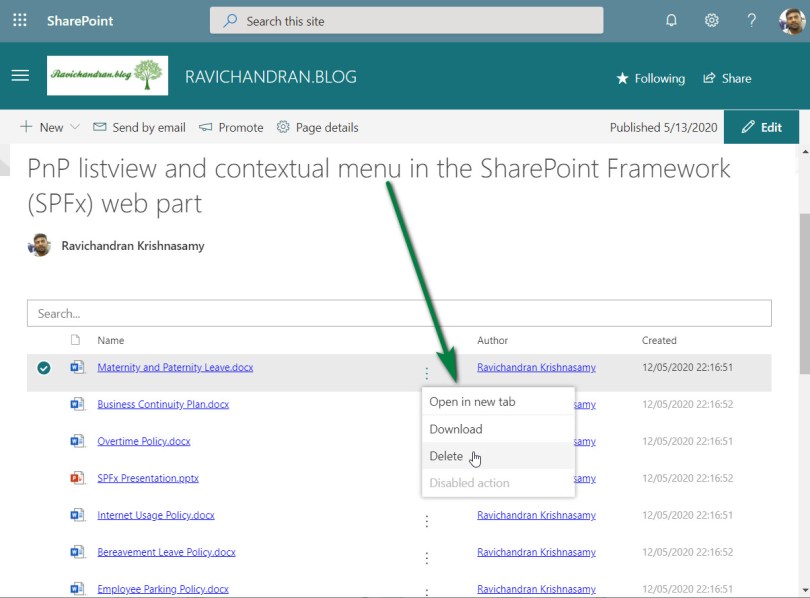
PnP listview and contextual menu in the SharePoint Framework (SPFx) web part

This article provide steps to implement the PnP Listview with contextual menu in the SharePoint Framework (SPFx), generally Listview control can be used to make fully custom list view for SharePoint List or Library and the contextual menu helps provide options to manages file or list item.

Create a new web part project

Open power shell and run following comment to create a new web part by running the Yeoman SharePoint Generator

yo @microsoft/sharepoint

When prompted:

Enter the webpart name as your solution name, and then select Enter.
Select Create a subfolder with solution name for where to place the files.
Select Y to allow the solution to be deployed to all sites immediately.
Select N on the question if solution contains unique permissions.
Select WebPart as the client-side component type to be created.

The next set of prompts ask for specific information about your web part:

Enter your web part name, and then select Enter.
Enter your web part description, and then select Enter.
Select React framework as the framework you would like to use, and then select Enter.

Start Visual Studio Code (or your favorite code editor) within the context of the newly created project folder.

cd .\web part name\
code .

Install the library and required dependencies

npm install @pnp/sp --save
npm install @pnp/spfx-controls-react --save --save-exact
npm install moment --save

Import the library into your application, update constructor, and access the root sp object in render for PnPjs libraries.

sp.setup({spfxContext: this.props.spcontect});

Configure the custom properties

Create a new source code file under the src\webparts\<Webpart name>\components\ folder of the solution. Create the new file I<web part name>State.ts and use it to create a TypeScript Interface

import { IViewField } from "@pnp/spfx-controls-react/lib/ListView";

export interface ISpfxPnpListviewContextualmenuState {
  items: any[];
  viewFields: IViewField[];
}

In addition, you need to update the render method of the client-side web part to create a properly configured instance of the React component for rendering. The following code shows the updated method definition.

  public render(): void {
    const element: React.ReactElement<ISpfxPnpListviewContextualmenuProps> = React.createElement(
      SpfxPnpListviewContextualmenu,
      {
        description: this.properties.description,
        context:this.context
      }
    );
    ReactDom.render(element, this.domElement);
  }

Update the tsx file under the components. First, add some import statements to import the types you defined earlier. Notice the import for I<web part name>Props and I<web part name>State. There are also some imports for the PnP components used to render the UI of the PnP React component and pnp sp imports.

import * as React from 'react';
import * as moment from 'moment';
import styles from './SpfxPnpListviewContextualmenu.module.scss';
import { ISpfxPnpListviewContextualmenuProps } from './ISpfxPnpListviewContextualmenuProps';
import { ISpfxPnpListviewContextualmenuState } from './ISpfxPnpListviewContextualmenuState';
import { ListView, IViewField, SelectionMode, GroupOrder, IGrouping } from "@pnp/spfx-controls-react/lib/ListView";
import { sp } from "@pnp/sp";
import { autobind } from 'office-ui-fabric-react/lib/Utilities';
import "@pnp/sp/webs";
import "@pnp/sp/files";
import "@pnp/sp/folders";
import { IfilemenuProps, filemenu } from './filemenu';

Replace this render function with the following code.

  public render(): React.ReactElement<ISpfxPnpListviewContextualmenuProps> {
    return (
      <div className={styles.spfxPnpListviewContextualmenu}>
        <ListView
          items={this.state.items}
          viewFields={this.state.viewFields}
          iconFieldName="ServerRelativeUrl"
          compact={true}
          selectionMode={SelectionMode.multiple}
          selection={this._getSelection}
          showFilter={true}
          filterPlaceHolder="Search..." />
      </div>
    );
  }

Adding ContextualMenu component

We have to create a new component for ContextualMenu, this ContextualMenu is from the Microsoft fluentui

import * as React from 'react';
import { IconButton } from 'office-ui-fabric-react';
import { ContextualMenuItemType } from 'office-ui-fabric-react/lib/ContextualMenu';
import { sp } from "@pnp/sp";
import "@pnp/sp/webs";
import "@pnp/sp/lists";
import "@pnp/sp/items";
import { autobind } from 'office-ui-fabric-react/lib/Utilities';

export interface IfilemenuProps {
    item: any;
    context: any;
    ondatachange: any;
}


export class filemenu extends React.Component<IfilemenuProps, {}> {

    public constructor(props: IfilemenuProps) {
        super(props);
        sp.setup({
            spfxContext: this.props.context
        });
        this.state = {
            panelOpen: false
        };
    }

    public render() {
        return (
            <div>
                <IconButton id='ContextualMenuButton1'
                    text=''
                    width='30'
                    split={false}
                    iconProps={{ iconName: 'MoreVertical' }}
                    menuIconProps={{ iconName: '' }}
                    menuProps={{
                        shouldFocusOnMount: true,
                        items: [
                            {
                                key: 'action1',
                                name: 'Open in new tab',
                                onClick: this.handleClick.bind(this, "open", this.props.item)
                            },
                            {
                                key: 'divider_1',
                                itemType: ContextualMenuItemType.Divider
                            },
                            {
                                key: 'action2',
                                name: 'Download',
                                onClick: this.handleClick.bind(this, "download", this.props.item)
                            },
                            {
                                key: 'action3',
                                name: 'Delete',
                                onClick: this.handleClick.bind(this, "delete", this.props.item)
                            },
                            {
                                key: 'disabled',
                                name: 'Disabled action',
                                disabled: true,
                                onClick: () => console.error('Disabled action should not be clickable.')
                            }
                        ]
                    }} />
            </div>
        );
    }

    @autobind
    private async handleClick(actionType: string, seletedfile: any, event) {
        if (actionType === 'open') {
            window.open(
                window.location.protocol + "//" + window.location.host + seletedfile.ServerRelativeUrl + "?web=1",
                '_blank'
            );
        }
        else if (actionType === 'download') {
            window.open(
                window.location.protocol + "//" + window.location.host + seletedfile.ServerRelativeUrl + "?web=0",
                '_blank'
            );
        }
        else if (actionType === 'delete') {
            let list = sp.web.lists.getByTitle("Policies");
            await list.items.getById(seletedfile["ListItemAllFields.ID"]).delete();
            this.props.ondatachange();
        }
    }
}

Update the React component type declaration and add a constructor, as shown in the following example and call the ContextualMenu component as the list view column.

export default class SpfxPnpListviewContextualmenu extends React.Component<ISpfxPnpListviewContextualmenuProps, ISpfxPnpListviewContextualmenuState> {
  constructor(props: ISpfxPnpListviewContextualmenuProps, state: ISpfxPnpListviewContextualmenuState) {
    super(props);
    sp.setup({
      spfxContext: this.props.context
    });
    var _viewFields: IViewField[] = [
      {
        name: "Name",
        linkPropertyName: "ServerRelativeUrl",
        displayName: "Name",
        sorting: true,
        minWidth: 250,
      },
      {
        name: "",
        sorting: false,
        maxWidth: 40,
        render: (rowitem: any) => {
          const element: React.ReactElement<IfilemenuProps> = React.createElement(
            filemenu,
            {
              item: rowitem,
              context: this.props.context,
              ondatachange: this._getfiles
            }
          );
          return element;
        }
      },
      {
        name: "Author.Title",
        displayName: "Author",
        sorting: false,
        minWidth: 180,
        render: (item: any) => {
          const authoremail = item['Author.UserPrincipalName'];
          return <a href={'mailto:' + authoremail}>{item['Author.Title']}</a>;
        }
      },
      {
        name: "TimeCreated",
        displayName: "Created",
        minWidth: 150,
        render: (item: any) => {
          const created = item["TimeCreated"];
          if (created) {
            const createdDate = moment(created);
            return <span>{createdDate.format('DD/MM/YYYY HH:mm:ss')}</span>;
          }
        }
      }
    ];
    this.state = { items: [], viewFields: _viewFields };
    this._getfiles();
  }

place the below code inside the react component code, these functions using PnPjs to get files from the SharePoint document library

  @autobind
  public async _getfiles() {
    const allItems: any[] = await sp.web.getFolderByServerRelativeUrl("/sites/TheLanding/Policies").files.select().expand("ListItemAllFields,Author").get();
    this.setState({ items: allItems });
  }

Deploy the solution

You’re now ready to build, bundle, package, and deploy the solution.

Run the gulp commands to verify that the solution builds correctly.

gulp build

Use the following command to bundle and package the solution.

gulp bundle
gulp package-solution

Browse to the app catalog of your target tenant and upload the solution package. You can find the solution package under the sharepoint/solution folder of your solution. It is the .sppkg file. After you upload the solution package in the app catalog. you can find and the web part anywhere across the tenant.

Sharing is caring!

If you have any questions, feel free to let me know in the comments section.
Happy coding!!!

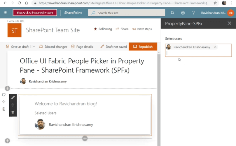
Office UI Fabric People Picker in Property Pane – SharePoint Framework (SPFx)

As we know Office UI Fabric which official front-end framework is for building a user interface that fits seamlessly into SharePoint modern experience. In this article, we going to see more detail about the adding custom controls like office UI fabric people picker and Persona in the property pane.

Creating a new SharePoint Framework web-part project

The first step we have to create a new SharePoint framework react web-part project, I have used SharePoint Framework version 1.8.2, if you have any question regarding set-up new SharePoint framework development environment then you can refer my one of the previous article where I explained simple steps to set up a new development environment and create the new project. While creating a project in the PowerShell you must select react framework.

Important files

In the new SharePoint framework web part solution contains many files, but in this article, we are going take look only files which are under src/webpart

Web part TS file (PropertyPaneSpFxWebPart.ts)

In this file, we create react element and created element assigned to the react DOM, also we are passing web part context as props so we can access these props in while create react component.

import * as React from 'react';
import * as ReactDom from 'react-dom';
import { BaseClientSideWebPart } from '@microsoft/sp-webpart-base';
import {
  IPropertyPaneConfiguration
} from '@microsoft/sp-property-pane';
import * as strings from 'PropertyPaneSpFxWebPartStrings';
import PropertyPaneSpFx from './components/PropertyPaneSpFx';
import { PropertyPanetextboxcustom } from './components/PropertyPaneControl';

export interface IPropertyPaneSpFxWebPartProps {
  selectedusers: any;
  onchange(stringvalue:string):void;
}

export default class PropertyPaneSpFxWebPart extends BaseClientSideWebPart<IPropertyPaneSpFxWebPartProps> {

  public render(): void {
    if(this.properties.selectedusers == "[]")
    {
      this.properties.selectedusers=[];
    }
    const element: React.ReactElement<IPropertyPaneSpFxWebPartProps> = React.createElement(
      PropertyPaneSpFx,
      {
        selectedusers: this.properties.selectedusers,
        onchange:this.onChanged
      }
    );
    ReactDom.render(element, this.domElement);
  }

  private onChanged(stringvalue:any): void {
    this.properties.selectedusers=stringvalue;
    this.render();
  }


  protected getPropertyPaneConfiguration(): IPropertyPaneConfiguration {
    return {
      pages: [
        {
          header: {
            description: strings.PropertyPaneDescription
          },
          groups: [
            {
              groupName: strings.BasicGroupName,
              groupFields: [
                PropertyPanetextboxcustom(this.properties.selectedusers,this.onChanged.bind(this), this.context)
              ]
            }
          ]
        }
      ]
    };
  }
}

React component (CustomPeoplePicker.tsx)

In this file we creating the office UI fabric people picker component, So created component will be turned as property pane custom field in another file.

import * as React from 'react';
import { IPersonaProps } from 'office-ui-fabric-react/lib/Persona';
import { IPropertyFieldMessageBarPropsInternal } from './PropertyPaneControl';  
import { NormalPeoplePicker } from 'office-ui-fabric-react/lib/Pickers';
import { SPHttpClient, SPHttpClientResponse } from '@microsoft/sp-http'; 
import { autobind } from 'office-ui-fabric-react/lib//Utilities'; 

export default class customtext extends React.Component<IPropertyFieldMessageBarPropsInternal, {}> {

  public render(): React.ReactElement<{}> {
    return (
      <div>
          <NormalPeoplePicker onResolveSuggestions={this._onFilterChanged}  resolveDelay={200}  onChange={this._onChange1}/>
      </div>
    );
  }

  private _onChange1 = (items?:IPersonaProps[]) => {
    this.props.onPropertyChange(items);
  };

  @autobind 
  private _onFilterChanged(filterText: string) { 
    if (filterText) { 
      if (filterText.length > 2) { 
        return this.searchPeople(filterText);         
      } 
    } else { 
      return []; 
    } 
  } 

  private searchPeople(terms: string): IPersonaProps[] | Promise<IPersonaProps[]> { 
    return new Promise<IPersonaProps[]>((resolve, reject) => 
      this.props.spcontect.spHttpClient.get(`${this.props.spcontect.pageContext.web.absoluteUrl}/_api/search/query?querytext='*${terms}*'&rowlimit=10&sourceid='b09a7990-05ea-4af9-81ef-edfab16c4e31'`, 
        SPHttpClient.configurations.v1, 
        { 
          headers: { 
            'Accept': 'application/json;odata=nometadata', 
            'odata-version': '' 
          } 
        }).then((response: SPHttpClientResponse): Promise<{ PrimaryQueryResult: any }> => { 
          return response.json(); 
        }).then((response: { PrimaryQueryResult: any }): void => { 
          let relevantResults: any = response.PrimaryQueryResult.RelevantResults; 
          let resultCount: number = relevantResults.TotalRows; 
          let people = []; 
          if (resultCount > 0) { 
            relevantResults.Table.Rows.forEach(function (row) { 
              let persona: IPersonaProps = {}; 
              row.Cells.forEach(function (cell) { 
                if (cell.Key === 'JobTitle') 
                  persona.secondaryText = cell.Value; 
                if (cell.Key === 'PictureURL') 
                  persona.imageUrl = cell.Value; 
                if (cell.Key === 'PreferredName') 
                  persona.primaryText = cell.Value; 
              }); 
              people.push(persona); 
            }); 
          } 
          resolve(people); 
        }, (error: any): void => { 
          reject(); 
        })); 
  }
}

Property pane component file (PropertyPaneControl.ts)

In this file, we implement the generic interface of IPropertyPaneField and rendering the office UI fabric people picker component which we created. at the end of the file, we also created one function for calling the property pane field, basically this will help us to call without calling as a new class we can directly call this function.  

import * as React from 'react';
import * as ReactDom from 'react-dom';
import {  
  IPropertyPaneCustomFieldProps,  
  IPropertyPaneField,  
  PropertyPaneFieldType  
} from '@microsoft/sp-webpart-base';  
import customtext from './CustomPeoplePicker';

export interface IPropertyFieldMessageBarPropsInternal extends IPropertyPaneCustomFieldProps {  
  onPropertyChange(items:any[]): void;    
  onRender(elem: HTMLElement): void;
  onDispose(elem: HTMLElement): void;
  key: string;  
  spcontect?:any|null;
}  


export default class propertypanecontrol implements IPropertyPaneField<IPropertyFieldMessageBarPropsInternal> {
  public properties: IPropertyFieldMessageBarPropsInternal;  
  public targetProperty: string;  
  public type: PropertyPaneFieldType = PropertyPaneFieldType.Custom;  
 // private onPropertyChange: (propertyPath: string, oldValue: any, newValue: any) => void;  
  private key: string;  
  private elem: HTMLElement;

  constructor(targetProperty: string,  userproperties: IPropertyFieldMessageBarPropsInternal) {
    this.targetProperty = targetProperty;
    this.render = this.render.bind(this);  
    this.properties = userproperties;  
    this.properties.onDispose = this.dispose;  
    this.properties.onRender = this.render;  
    this.properties.spcontect=userproperties.spcontect;
  //  this.onPropertyChange = userproperties.onPropertyChange;  
    this.key = userproperties.key;  
  }

  public render(elem: HTMLElement): void {
    if (!this.elem) {
      this.elem = elem;
    }
    const element: React.ReactElement<IPropertyFieldMessageBarPropsInternal> = React.createElement(customtext, {  
      onDispose: null,  
      onRender: null,  
      onPropertyChange: this.onChanged.bind(this),
      key: this.key,
      spcontect: this.properties.spcontect 
    });
    ReactDom.render(element, elem);
  }

  private onChanged(selectedusers: any): void {
    this.properties.onPropertyChange(selectedusers);
  }

  private dispose(elem: HTMLElement): void {  
  }
}

export function PropertyPanetextboxcustom(selectedusers:any, onChanged,spcontect?:any|null): IPropertyPaneField<IPropertyPaneCustomFieldProps> { 
  var newProperties: IPropertyFieldMessageBarPropsInternal = {  
    onPropertyChange: onChanged,  
    onDispose: null,  
    onRender: null,  
    key: 'test',
    spcontect:spcontect
  };  
  return new propertypanecontrol(selectedusers,newProperties);  
} 

Web part body react component (PropertyPaneSpFx.tsx)

In this file we creating web parts body part as react component, we used the office UI fabric Persona component to list the selected users 

import * as React from 'react';
import styles from './PropertyPaneSpFx.module.scss';
import { IPropertyPaneSpFxWebPartProps } from '../PropertyPaneSpFxWebPart';
import { escape } from '@microsoft/sp-lodash-subset';
import { Persona } from 'office-ui-fabric-react/lib/Persona';

export default class PropertyPaneSpFx extends React.Component<IPropertyPaneSpFxWebPartProps, {}> {
  public render(): React.ReactElement<IPropertyPaneSpFxWebPartProps> {
    return (
      <div className={ styles.propertyPaneSpFx }>
        <div className={ styles.container }>
          <div className={ styles.row }>
            <div className={ styles.column }>
              <span className={ styles.title }>Welcome to Ravichandran blog!</span>
              <p className={ styles.subTitle }>Seleted Users</p>
                {this.props.selectedusers.map((row, index) => (
                        <Persona {...row}  />
                ))}
            </div>
          </div>
        </div>
      </div>
    );
  }
}

Click below button to redirect Microsoft code galley to download this project

Sharing is caring!

If you have any questions, feel free to let me know in the comments section.
Happy coding!!!