This article provides steps to implement single or multi-select autocomplete drop-down list in the SharePoint Framework (SPFx) webpart, generally React select is a flexible and beautiful Select Input control for ReactJS with multi-select, autocomplete, async and creatable support.

Create a new web part project
Open power shell and run following comment to create a new web part by running the Yeoman SharePoint Generator
yo @microsoft/sharepointWhen prompted:
Enter the webpart name as your solution name, and then select Enter.
Select Create a subfolder with solution name for where to place the files.
Select Y to allow the solution to be deployed to all sites immediately.
Select N on the question if solution contains unique permissions.
Select WebPart as the client-side component type to be created.
The next set of prompts ask for specific information about your web part:
Enter your web part name, and then select Enter.
Enter your web part description, and then select Enter.
Select React framework as the framework you would like to use, and then select Enter.
Start Visual Studio Code (or your favorite code editor) within the context of the newly created project folder.
cd .\web part name\
code .
Install the library and required dependencies
npm install @pnp/sp --save
npm install --save react-select
Import the library into your application, update constructor, and access the root sp object in render for PnPjs libraries.
sp.setup({spfxContext: this.props.context});
Configure the custom properties
Create a new source code file under the src\webparts\<Webpart name>\components\ folder of the solution. Create the new file I<web part name>State.ts and use it to create a TypeScript Interface
export interface ISpfxReactSelectState {
  options: Ioption[];
  selectedvalue:Ioption;
  selectedvalues:Ioption[];
}

export interface Ioption
{
  value:string;
  label:string;
}
In addition, you need to update the render method of the client-side web part to create a properly configured instance of the React component for rendering. The following code shows the updated method definition.
  public render(): void {
    const element: React.ReactElement<ISpfxReactSelectProps> = React.createElement(
      SpfxReactSelect,
      {
        description: this.properties.description,
        context: this.context
      }
    );
    ReactDom.render(element, this.domElement);
  }
Update the tsx file under the components. First, add some import statements to import the types you defined earlier. Notice the import for I<web part name>Props and I<web part name>State. There are also some imports for the PnP components used to render the UI of the PnP React component and pnp sp imports.
import * as React from 'react';
import styles from './SpfxReactSelect.module.scss';
import { ISpfxReactSelectProps } from './ISpfxReactSelectProps';
import { ISpfxReactSelectState, Ioption } from './ISpfxReactSelectState';
import Select from 'react-select';
import { PrimaryButton, autobind } from 'office-ui-fabric-react';
import { IFieldInfo } from "@pnp/sp/fields/types";
import { sp } from "@pnp/sp";
import "@pnp/sp/fields";
import "@pnp/sp/webs";
import "@pnp/sp/lists";
import "@pnp/sp/items";
Replace this render function with the following code.
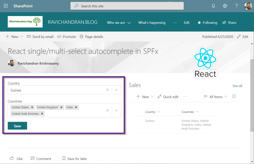
  public render(): React.ReactElement<ISpfxReactSelectProps> {
    return (
      <div className={styles.spfxReactSelect}>
        <label>Country</label>
        <Select
          className="basic-single"
          classNamePrefix="Select"
          isClearable={true}
          isSearchable={true}
          value={this.state.selectedvalue}
          options={this.state.options}
          onChange={(value) => this.setState({ selectedvalue: value })}
        />
        <br />
        <label>Countries</label>
        <Select
          className="basic-single"
          classNamePrefix="Select"
          isClearable={true}
          isSearchable={true}
          isMulti
          value={this.state.selectedvalues}
          options={this.state.options}
          onChange={(value) => this.setState({ selectedvalues: value })}
        />
        <br />
        <PrimaryButton text="Save" onClick={this._savevalues} />
      </div>
    );
  }
Update the React component type declaration and add a constructor, as shown in the following example.
export default class SpfxReactSelect extends React.Component<ISpfxReactSelectProps, ISpfxReactSelectState> {
  constructor(props: ISpfxReactSelectProps, state: ISpfxReactSelectState) {
    super(props);
    sp.setup({ spfxContext: this.props.context });
    this.state = ({ options: [], selectedvalue: null, selectedvalues: [] })
    this._getvalues();
  }
place the below code inside the react component code, these functions using PnPjs to get and set values into the SharePoint list
  private async _getvalues() {
    const field1: IFieldInfo = await sp.web.lists.getByTitle("Sales").fields.getByInternalNameOrTitle("Country")();
    let listofCountries: Ioption[] = [];
    field1["Choices"].forEach(function (Country, i) {
      listofCountries.push({ value: Country, label: Country });
    });
    const item: any = await sp.web.lists.getByTitle("Sales").items.getById(1).get();
    let selectedCountries: Ioption[] = [];
    item.Countries.forEach(function (selected, i) {
      selectedCountries.push({ value: selected, label: selected });
    });
    let selectedCountry: Ioption = { label: item.Country, value: item.Country };
    this.setState({ options: listofCountries, selectedvalue: selectedCountry, selectedvalues: selectedCountries })
  }
  @autobind
  private async _savevalues() {
    let res: string[] = [];
    this.state.selectedvalues.forEach(function (va, i) {
      res.push(va.value);
    });
    let list = sp.web.lists.getByTitle("Sales");
    const i = await list.items.getById(1).update({
      Country: this.state.selectedvalue.value,
      Countries: { results: res }
    });
  }
Deploy the solution
You’re now ready to build, bundle, package, and deploy the solution.
Run the gulp commands to verify that the solution builds correctly.
gulp buildUse the following command to bundle and package the solution.
gulp bundle --ship
gulp package-solution --ship
Browse to the app catalog of your target tenant and upload the solution package. You can find the solution package under the sharepoint/solution folder of your solution. It is the .sppkg file. After you upload the solution package in the app catalog. you can find and the web part anywhere across the tenant.

Sharing is caring!
If you have any questions, feel free to let me know in the comments section.
Happy coding!!!
 Ravichandran Blog
I didn’t get any drop down
LikeLiked by 1 person
private async _getvalues() {
const field1: IFieldInfo = await sp.web.lists.getByTitle(“SalesInvoiceHeaderMaster”).fields.getByInternalNameOrTitle(“OrderNo”)();
let listofOrderNo: Ioption[] = [];
field1[“Choices”].forEach(function (OrderNo, i) {
listofOrderNo.push({ value: OrderNo, label: OrderNo });
});
const item: any = await sp.web.lists.getByTitle(“SalesInvoiceHeaderMaster”).items.getById(1).get();
let selectedInvoiceNos: Ioption[] = [];
item.InvoiceNo.forEach(function (selected, i) {
selectedInvoiceNos.push({ value: selected, label: selected });
});
let selectedOrderNo: Ioption = { label: item.OrderNo, value: item.OrderNo };
this.setState({ options: listofOrderNo, selectedvalue: selectedOrderNo,selectedvalues:selectedInvoiceNos })
}
LikeLiked by 1 person
Your code looks perfect, I don’t get any Idea. Did you resolved already? else message me so I’ll help you to deep look
LikeLiked by 1 person
field1[“Choices”].forEach gives an error “error TS2339: Property ‘forEach’ does not exist on type ‘IFieldInfo’ “
LikeLiked by 1 person
Make sure you doing this for choice field type
LikeLiked by 1 person