
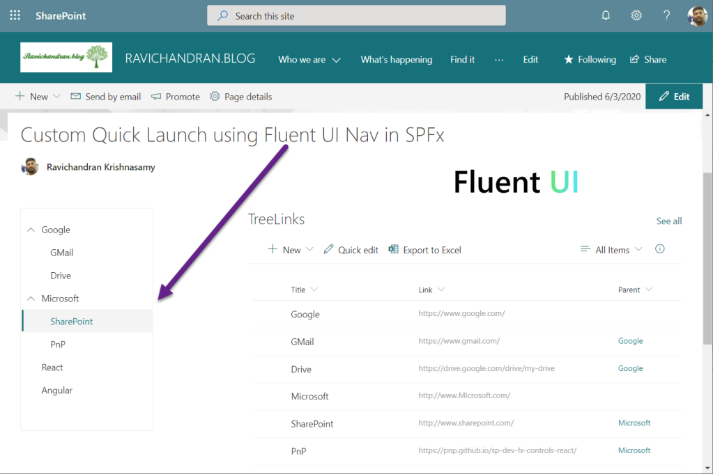
This article provides steps to implement the Custom Quick Launch using Fluent UI Nav in the SharePoint Framework (SPFx) web part, generally, Fluent UI Navs (also called “left nav” or “navigation pane”) provide links to the main areas of an app or a site. In larger configurations, the Nav is always on-screen, usually on the left of the view. In smaller configurations, the Nav may collapse into a skinnier version or be completely hidden until the user taps an icon.
Create a new web part project
Open power shell and run following comment to create a new web part by running the Yeoman SharePoint Generator
yo @microsoft/sharepointWhen prompted:
Enter the webpart name as your solution name, and then select Enter.
Select Create a subfolder with solution name for where to place the files.
Select Y to allow the solution to be deployed to all sites immediately.
Select N on the question if solution contains unique permissions.
Select WebPart as the client-side component type to be created.
The next set of prompts ask for specific information about your web part:
Enter your web part name, and then select Enter.
Enter your web part description, and then select Enter.
Select React framework as the framework you would like to use, and then select Enter.
Start Visual Studio Code (or your favorite code editor) within the context of the newly created project folder.
cd .\web part name\
code .
Install the library and required dependencies
npm install @pnp/sp --saveImport the library into your application, update constructor, and access the root sp object in render for PnPjs libraries.
sp.setup({spfxContext: this.props.contect});
Configure the custom properties
Create a new source code file under the src\webparts\<Webpart name>\components\ folder of the solution. Create the new file I<web part name>State.ts and use it to create a TypeScript Interface
import { INavLinkGroup } from 'office-ui-fabric-react/lib/Nav';
export interface ISpfxFluentuiNavState {
  links: INavLinkGroup[];
}
In addition, you need to update the render method of the client-side web part to create a properly configured instance of the React component for rendering. The following code shows the updated method definition.
  public render(): void {
    const element: React.ReactElement<ISpfxFluentuiNavProps> = React.createElement(
      SpfxFluentuiNav,
      {
        description: this.properties.description,
        context:this.context
      }
    );
    ReactDom.render(element, this.domElement);
  }
Update the tsx file located under the components. First, add some import statements to import the types you defined earlier. Notice the import for I<web part name>Props and I<web part name>State. There are also some imports for the PnP components used to render the UI of the PnP React component and pnp sp imports.
import * as React from 'react';
import styles from './SpfxFluentuiNav.module.scss';
import { ISpfxFluentuiNavProps } from './ISpfxFluentuiNavProps';
import { ISpfxFluentuiNavState } from './ISpfxFluentuiNavState';
import { Nav, INavLink, INavStyles, INavLinkGroup } from 'office-ui-fabric-react/lib/Nav';
import { sp } from "@pnp/sp";
import "@pnp/sp/webs";
import "@pnp/sp/lists";
import "@pnp/sp/items";
Replace this render function with the following code.
  public render(): React.ReactElement<ISpfxFluentuiNavProps> {
    return (
      <div className={styles.spfxFluentuiNav}>
        <Nav onLinkClick={this._onLinkClick}
          selectedKey="5"
          ariaLabel="Nav basic example"
          styles={navStyles}
          groups={this.state.links} />
      </div>
    );
  }
Update the React component type declaration and add a constructor, as shown in the following example.
export default class SpfxFluentuiNav extends React.Component<ISpfxFluentuiNavProps, ISpfxFluentuiNavState> {
  constructor(props: ISpfxFluentuiNavProps) {
    super(props);
    sp.setup({
      spfxContext: this.props.context
    });
    this.state = {
      links: []
    }
    this._getLinks();
  }
place the below code inside the react component code, these functions using PnPjs to get links from the SharePoint list
  private async _getLinks() {
    const allItems: any[] = await sp.web.lists.getByTitle("TreeLinks").items.getAll();
    const linkgroupcol: INavLinkGroup[] = [{ links: [] }];
    let linkcol: INavLink[] = linkgroupcol[0].links;
    allItems.forEach(function (v, i) {
      if (v["ParentId"] == null) {
        linkcol.push({ name: v["Title"], url: v["Link"], links: [], key: v.Id + '', isExpanded: true, target: '_blank' })
      }
      else {
        const link: INavLink = { key: v.Id + '', name: v["Title"], url: v["Link"], links: [], target: '_blank' }
        var treecol: INavLink[] = linkcol.filter(function (value) { return value.key == v["ParentId"] })
        if (treecol.length != 0) {
          treecol[0].links.push(link);
        }
      }
    });
    console.log(linkgroupcol);
    this.setState({ links: linkgroupcol });
  }
  private _onLinkClick(ev?: React.MouseEvent<HTMLElement>, item?: INavLink) {
    if (item && item.name === 'SharePoint') {
      console.log('SharePoint link clicked');
    }
  }
Deploy the solution
You’re now ready to build, bundle, package, and deploy the solution.
Run the gulp commands to verify that the solution builds correctly.
gulp buildUse the following command to bundle and package the solution.
gulp bundle --ship
gulp package-solution --ship
Browse to the app catalog of your target tenant and upload the solution package. You can find the solution package under the sharepoint/solution folder of your solution. It is the .sppkg file. After you upload the solution package in the app catalog. you can find and the web part anywhere across the tenant.

Sharing is caring!
If you have any questions, feel free to let me know in the comments section.
Happy coding!!!
 Ravichandran Blog
Hi, can you let me know, whether this can be used as an top navigation menu too. I need an application customizer extension with tree structure but at the top placeholder. Can i use the same thing there OR suggest me which control i can use it there as i need responsive design multilevel tree structure with the same layout. Thanks
LikeLike
Hi Sanket,
you have two options,
https://ravichandran.blog/2019/04/14/mega-menu-using-sharepoint-framework-spfx-extensions/
https://developer.microsoft.com/en-us/fluentui#/controls/web/commandbar
LikeLike
‘INavLink’ is not assignable to parameter of type ‘INavLinkGroup’.Have you faced this issue
LikeLike
I have not faced that issue, could you try to run this project in your end. So you can get some idea
https://github.com/ravichandran-blog/SPFx/tree/master/spfx-fluentui-nav
LikeLike
Hi Ravi, this is great artical and helpful for my usecase.
can you give we hit how to replace existing quick launch with this webaprt ?
LikeLike
For hide existing quick launch you can use application customizer and you can use page template option to use your custom quick launch
LikeLike
Hi Ravi
Great article and example, bu I am also facing the ‘INavLink’ is not assignable to parameter of type ‘INavLinkGroup’ problem.
any thoughts?
LikeLike
Hi,
Not sure where you getting that error, for me works fine, can you please share the more details like which line you getting this error
refer this url for full page code view
https://github.com/ravichandran-blog/SPFx/blob/master/spfx-fluentui-nav/src/webparts/spfxFluentuiNav/components/SpfxFluentuiNav.tsx
LikeLike
Hi Ravi i have used the above example. the menu are not expanding not able to see the child any suggestion i have downloaded your copy also
LikeLike
This is not working anymore, spent lot of time. the child is not shown in correct way everything is expanded. Suggest to update the code
LikeLike
I hope you did the mistake while populating the data in the list, for me all works fine
https://ravichandran.blob.core.windows.net/blogfiles/Video_2020-09-26_005056.wmv
LikeLike
Title- single line of text, Link- single line of text, Parent – Hyperlink, these are the three column types right
LikeLike
“Parent” is the lookup of the same list’s Title field
LikeLiked by 1 person
ok, thank you.
its working but nested childs are not working can you update the code for the same
LikeLiked by 1 person
HI Ravi,
Im waiting for your reply on child nodes, will you be updating the code??
LikeLiked by 1 person
You have to work for your requirements, I don’t have time to work for you
LikeLiked by 1 person
I created one ore column called ParentId and then its working, do you have code for nested childs, now it supports only single child, below Gmail i need few childs
LikeLiked by 1 person
Hi, great article, have you find a way to deploy it to all pages in the left navigation place automatically for all pages? as a chrome or replace the existing OOB control?
LikeLike
Hi Freddie,
If you want to add to all pages, then create SPFx application customizer and place the quick launch using JQuery.
LikeLike