For make mega menu in Morden SharePoint, we can use SharePoint framework’s application customizer under extension category. Mega menu is one of the most important user interfaces in the SharePoint Internet.

For build this mega menu I have used the SharePoint Framework version of 1.8. while create SharePoint project using yeoman generator we have to select No for this question of “Will the components in the solution require permissions to access web APIs that are unique and not shared with other components in the tenant?” then select Extension after that select Application Customizer.

After the project created, edit the file under src ->extensions then select the TS extension file and import following modules BaseApplicationCustomizer, PlaceholderContent, and PlaceholderName from @microsoft/sp-application-base. After that import files which are required build your mega menu example images or CSS or JS files. Here I just imported one CSS file and one Image file.
I’m using Bulma CSS for build mega menu, in the onInit event bind the changed event into the place holder provider and call the _renderPlaceHolders function in that event.
I using static content of HTML, it can be changed as dynamic content like getting menu link and title from a SharePoint list.
import { override } from '@microsoft/decorators';
import { Log } from '@microsoft/sp-core-library';
import {
BaseApplicationCustomizer,
PlaceholderContent,
PlaceholderName
} from '@microsoft/sp-application-base';
import * as strings from 'MegaMenuSpFxApplicationCustomizerStrings';
const LOG_SOURCE: string = 'MegaMenuSpFxApplicationCustomizer';
require('./bulma.css');
const logo: any = require('./ravilogo.png');
export interface IMegaMenuSpFxApplicationCustomizerProperties {
Top: string;
}
/** A Custom Action which can be run during execution of a Client Side Application */
export default class MegaMenuSpFxApplicationCustomizer
extends BaseApplicationCustomizer {
// These have been added
private _topPlaceholder: PlaceholderContent | undefined;
private _bottomPlaceholder: PlaceholderContent | undefined;
@override
public onInit(): Promise {
Log.info(LOG_SOURCE, `Initialized ${strings.Title}`);
this.context.placeholderProvider.changedEvent.add(this, this._renderPlaceHolders);
this._renderPlaceHolders();
return Promise.resolve();
}
private _renderPlaceHolders(): void {
console.log("HelloWorldApplicationCustomizer._renderPlaceHolders()");
console.log(
"Available placeholders: ",
this.context.placeholderProvider.placeholderNames
.map(name => PlaceholderName[name])
.join(", ")
);
// Handling the top placeholder
if (!this._topPlaceholder) {
this._topPlaceholder = this.context.placeholderProvider.tryCreateContent(
PlaceholderName.Top,
{ onDispose: this._onDispose }
);
// The extension should not assume that the expected placeholder is available.
if (!this._topPlaceholder) {
console.error("The expected placeholder (Top) was not found.");
return;
}
if (this.properties) {
let topString: string = this.properties.Top;
if (!topString) {
topString = "(Top property was not defined.)";
}
if (this._topPlaceholder.domElement) {
this._topPlaceholder.domElement.innerHTML = `
<div class="navbar-brand">
<a class="navbar-item" href="https://ravichandran.blog/">
<img src="${logo}" alt="Bulma: a modern CSS framework based on Flexbox" width="112" height="28">
</a>
<div class="navbar-burger burger">
<span></span>
<span></span>
<span></span></div>
</div>
<div id="navMenubd-example" class="navbar-menu">
<div class="navbar-start">
<div class="navbar-item has-dropdown is-hoverable">
<a class="navbar-link is-active" href="#">
Docs
</a>
<div class="navbar-dropdown ">
<a class="navbar-item " href="#">Overview</a>
<a class="navbar-item " href="#">Modifiers</a>
<a class="navbar-item " href="#">Columns</a>
<a class="navbar-item " href="#">Layout</a>
<a class="navbar-item " href="#">Form</a>
<a class="navbar-item " href="#">Elements</a>
<a class="navbar-item is-active" href="#">Components</a>
<hr class="navbar-divider">
<div class="navbar-item">
<div>
<p class="is-size-6-desktop">
<strong class="has-text-info">0.5.1</strong></p>
<small>
<a class="bd-view-all-versions" href="/versions">View all versions</a>
</small></div>
</div>
</div>
</div>
<div class="navbar-item has-dropdown is-hoverable is-mega">
<div class="navbar-link">
Blog</div>
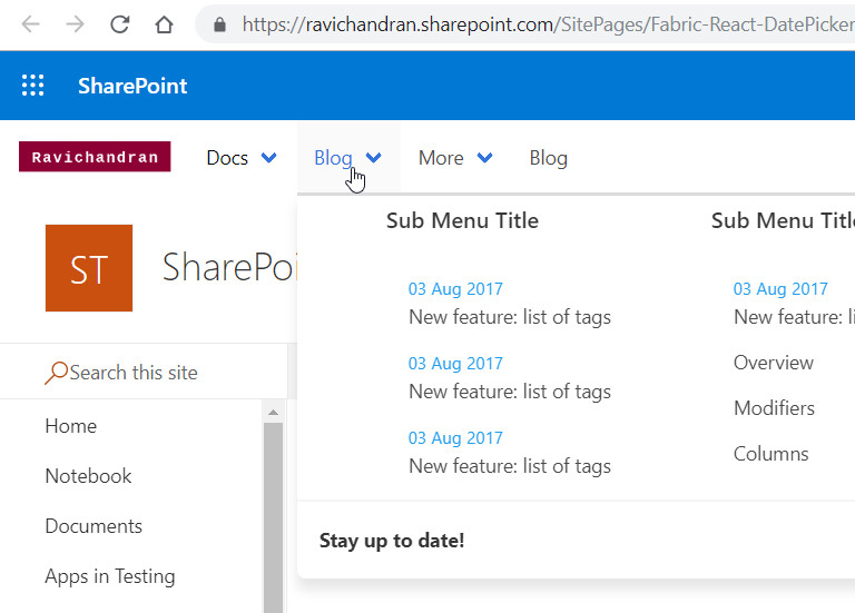
<div id="blogDropdown" class="navbar-dropdown ">
<div class="container is-fluid">
<div class="columns">
<div class="column">
<h1 class="title is-6 is-mega-menu-title">Sub Menu Title</h1>
<a class="navbar-item" href="#">
<div class="navbar-content">
<small class="has-text-info">03 Aug 2017</small>
New feature: list of tags
</div>
</a>
<a class="navbar-item" href="#">
<div class="navbar-content">
<small class="has-text-info">03 Aug 2017</small>
New feature: list of tags
</div>
</a>
<a class="navbar-item" href="#">
<div class="navbar-content">
<small class="has-text-info">03 Aug 2017</small>
New feature: list of tags
</div>
</a></div>
<div class="column">
<h1 class="title is-6 is-mega-menu-title">Sub Menu Title</h1>
<a class="navbar-item" href="#">
<div class="navbar-content">
<small class="has-text-info">03 Aug 2017</small>
New feature: list of tags
</div>
</a>
<a class="navbar-item " href="#">
Overview
</a>
<a class="navbar-item " href="#">
Modifiers
</a>
<a class="navbar-item " href="#">
Columns
</a></div>
<div class="column">
<h1 class="title is-6 is-mega-menu-title">Sub Menu Title</h1>
<a class="navbar-item" href="#">
<div class="navbar-content">
<small class="has-text-info">03 Aug 2017</small>
New feature: list of tags
</div>
</a>
<a class="navbar-item" href="#">
<div class="navbar-content">
<small class="has-text-info">03 Aug 2017</small>
New feature: list of tags
</div>
</a>
<a class="navbar-item" href="#">
<div class="navbar-content">
<small class="has-text-info">03 Aug 2017</small>
New feature: list of tags
</div>
</a>
</div>
<div class="column">
<h1 class="title is-6 is-mega-menu-title">Sub Menu Title</h1>
<a class="navbar-item " href="#">
Overview
</a>
<a class="navbar-item " href="#">
Modifiers
</a>
<a class="navbar-item " href="#">
Columns
</a>
<a class="navbar-item " href="#">
Layout
</a></div>
</div>
</div>
<hr class="navbar-divider">
<div class="navbar-item">
<div class="navbar-content">
<div class="level is-mobile">
<div class="level-left">
<div class="level-item">
<strong>Stay up to date!</strong></div>
</div>
<div class="level-right">
<div class="level-item">
<a class="button bd-is-rss is-small" href="#">
<span class="icon is-small">
<i class="fa fa-rss"></i>
</span>
<span>Subscribe</span>
</a></div>
</div>
</div>
</div>
</div>
</div>
</div>
<div class="navbar-item has-dropdown is-hoverable">
<div class="navbar-link">
More</div>
<div id="moreDropdown" class="navbar-dropdown ">
<a class="navbar-item " href="#">
<div class="level is-mobile">
<div class="level-left">
<div class="level-item">
<strong>Extensions</strong>
<small>Side projects to enhance Bulma</small>
</div>
</div>
<div class="level-right">
<div class="level-item">
<span class="icon has-text-info">
<i class="fa fa-plug"></i>
</span></div>
</div>
</div>
</a></div>
</div>
<a class="navbar-item " href="https://ravichandran.blog/">
Blog
</a></div>
</div>
`;
}
}
}
}
private _onDispose(): void {
console.log('[HelloWorldApplicationCustomizer._onDispose] Disposed custom top and bottom placeholders.');
}
}
While you run the application in workbench you will below warning message, click “Load debug scrips” for run our scrips. if you want to install this add-in permanently in the SharePoint check my previous article for deploy in SharePoint


Sharing is caring!
If you have any questions, feel free to let me know in the comments section.
Happy coding!!!
 Ravichandran Blog
Is it possible to set this menu on SharePoint 2016?
LikeLike
Sorry! not possible. SPFx mega menu only work in the modern pages. Its support both SharePoint 2019 and SharePoint online
LikeLike
Hy,
Thank you a lot for this extention ,
il was very helpful for me, but I have a problem trying to deploy it to my Sharepoint 2019 on premise App Catalog, i receive the following error: “There were errors when validating the App manifest.: Xml Validation Exception: ‘The ‘IsDomainIsolated’ attribute is not declared.’ on line ‘1’, position ‘310’.”
Any help please
LikeLike
Hi Rosa,
In the config/package-solution.json file, you can find the isDomainIsolated property, change the value to true.
LikeLike
Thank you for reply
LikeLike
This looks great, I have installed this on to our Sharepoint 2019 app catalog and it is enabled and deployed. But I cannot seem to see where to now add it from – it does not appear in list of apps when I try to “Add a new app”. Do I need to add it from somewhere else?
LikeLike
Sorry for the delayed reply,
You may set “skipFeatureDeployment” is false while creating a project then you need to enable the feature. let me know if you have any question.
LikeLike
Hi Ravi,
Thanks for the great blog. Is it possible to have a dynamic mega menu based what is being assigned to the users on the site.
LikeLike
Hi Venkatesh,
Yes, possible. check below link for find REST API Url
https://docs.microsoft.com/en-us/previous-versions/office/developer/sharepoint-rest-reference/dn600183(v=office.15)?redirectedfrom=MSDN#menunode-complex-type
LikeLike
I am new really to the SPFx development and for Microsoft Technologies. If there is any readymade code, please share it here. That will be really helpful.
LikeLike
Thanks Ravichandran for nice blog.
Complete code link is not available it seems, can you please provide updated link for the same.
Also do you have similar implementions with dynamic link from SP list.
Thanks,
Saroj Jha
LikeLike
Thanks for informed this, download link updated, for dynamic links just get the list items using SharePoint REST API and loop the data to build the HTML
LikeLike
Does this Solution work for SharePoint 2019 On Premise. I have it deployed to my app catalog and I can’t see where or how to use.
LikeLike
Hi Brian,
I’m just build that for SharePoint Online, you just create new SPFX project for On-Premise and reuse this same code
LikeLike
Can we manage mega menu content based on group and roles
LikeLike
Yes, we can because this is custom build menu.
LikeLike
Hi Ravi, I have few questions on Mega menu in modern sites SharePoint online. Can I have your Email contact please!
LikeLike
Message me in fb
https://fb.com/sptechnet
LikeLike
Hi Ravi,
I’ve implemented the custom megamenu but facing issue with render experience wherein I see ootb page header for first few seconds and then my custom mega menu. Any idea ?
LikeLike
It is expected behaviour only, there is no workaround for this.
LikeLike
I see you are using Bulma CSS. But for some reason this does not work with Mobile devices (it does not show the Hamburger menu). What could be the problem?
LikeLike
Sorry!, I don’t have any idea
LikeLike
hi can you tell how can fetch this links from sharepoint list and then show in extension
LikeLike
You can follow this link to fetch links from the SharePoint list and do one loop to show links in the extension
https://github.com/ravichandran-blog/SPFx/blob/master/spfx-ant-table/src/webparts/spfxAntTable/components/SpfxAntTable.tsx#L19
LikeLike
Contact me in the https://twitter.com/messages, my id is @spfx_blog
LikeLike
Need some urgent help on this can you share your contact details
LikeLike
What if we want to design a hamburger megamenu for mobile?
LikeLike